· indesign · illustrator · photoshop · posters · magazine design · book covers · typesetting
Typography
FEATURED IN
the Polk Museum of Art
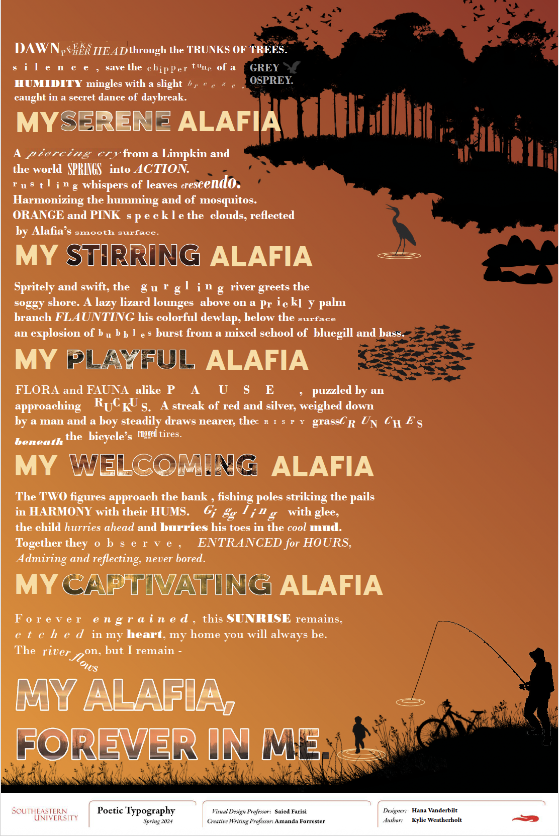
Inspired by Kylie Weatherholt's poem about the Alafia River in Florida, I was given the opportunity to design a poster as the vehicle for her work. After a few meetings, we discussed her inspiration, vision, and personal taste. A color palette and sketches later, I fleshed out the approved vision using Indesign, Illustrator, Photoshop, and my love of typography. I chose to capture the activity and life of her poem using creative typography. Using Adobe Illustrator, and emphasized the main word by filling them with photos of nature using photoshop! Along with other poet and designer pairs, the final version was on display in the Polk Museum of Art for a month.
· My Alafia Collaborative Poster ·

This project explores typography as a visual medium rather than just a vehicle for language. Through a series of posters, I treat type as both material and subject, allowing form to take precedence over readability. While many compositions focus on the letter “V” as a central motif, others incorporate Bible verses, shifting the exploration from a single form to full text as image. Across both approaches, I experiment with structure, repetition, and variation within a restrained grid system.


· letterform variations and type ·
· Movie Poster ·
Inspired by the magazine style of Will Bradley and Peter Behrns, through a simplistic/color-blocked lens, I created a poster for one of my favorite movies, The Great Gatsby. This piece holds to the simplistic vibe of 1920's magazines while adding a layered depth. This mirrors the levels and layers of complexity in the stories and characters of The Great Gatsby. I color blocked shapes in illustrator to create the mansion and green light. I then brought those into InDesign where I compiled the mansion and my photoshopped image of the man's eyes, finishing it off with true to the 20's typography!


· Typeface Family Posters·


After researching one of my favorite Typefaces, Didone, I chose to create a 3 series poster showcasing 3 fonts from the Didone family! I wrote an excerpt on each creator of the fonts, as well as highlighted the features of each font using abstract shapes, and deconstructionist layouts.
Typesetting
.png)
.png)
.png)
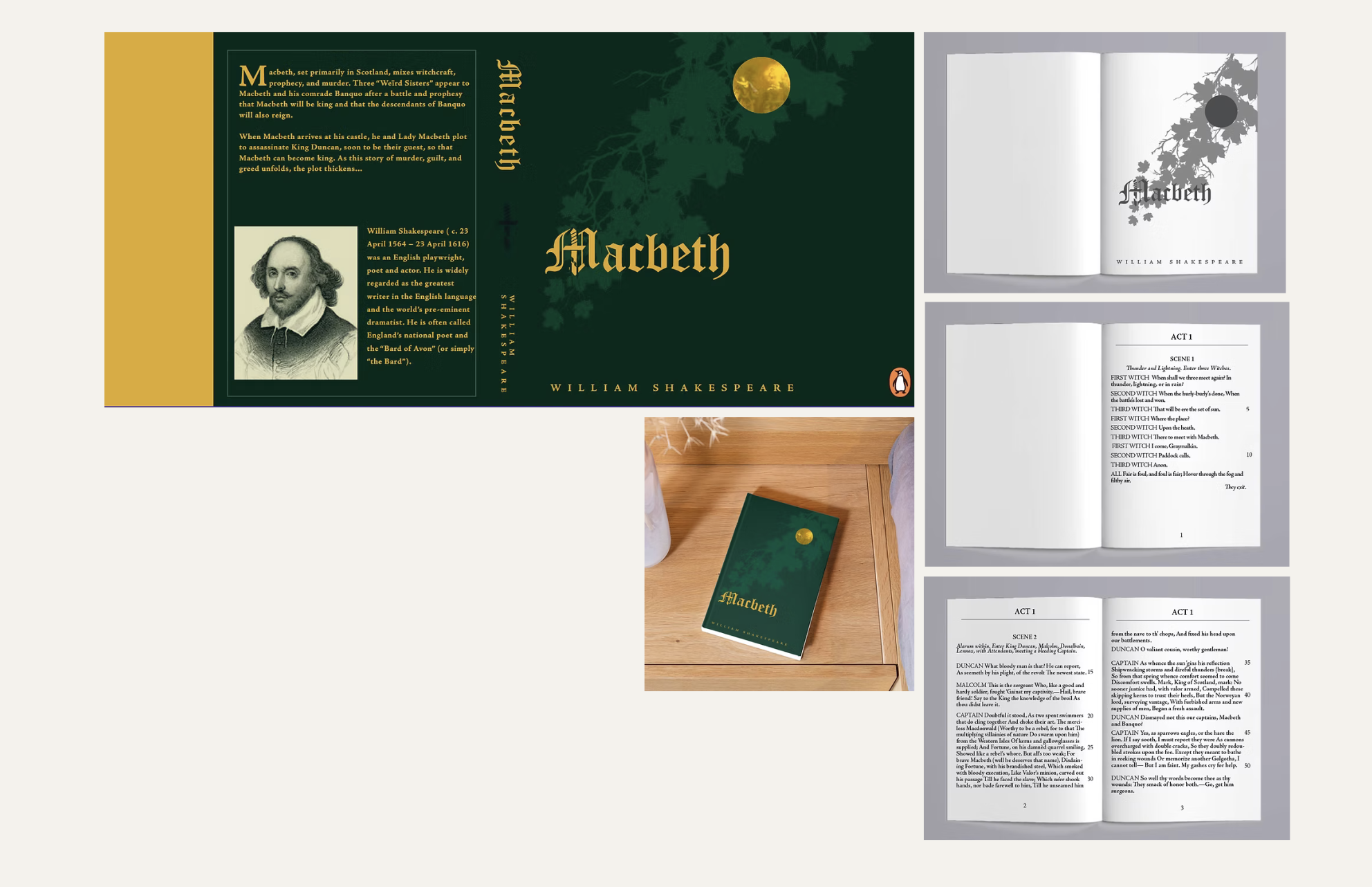
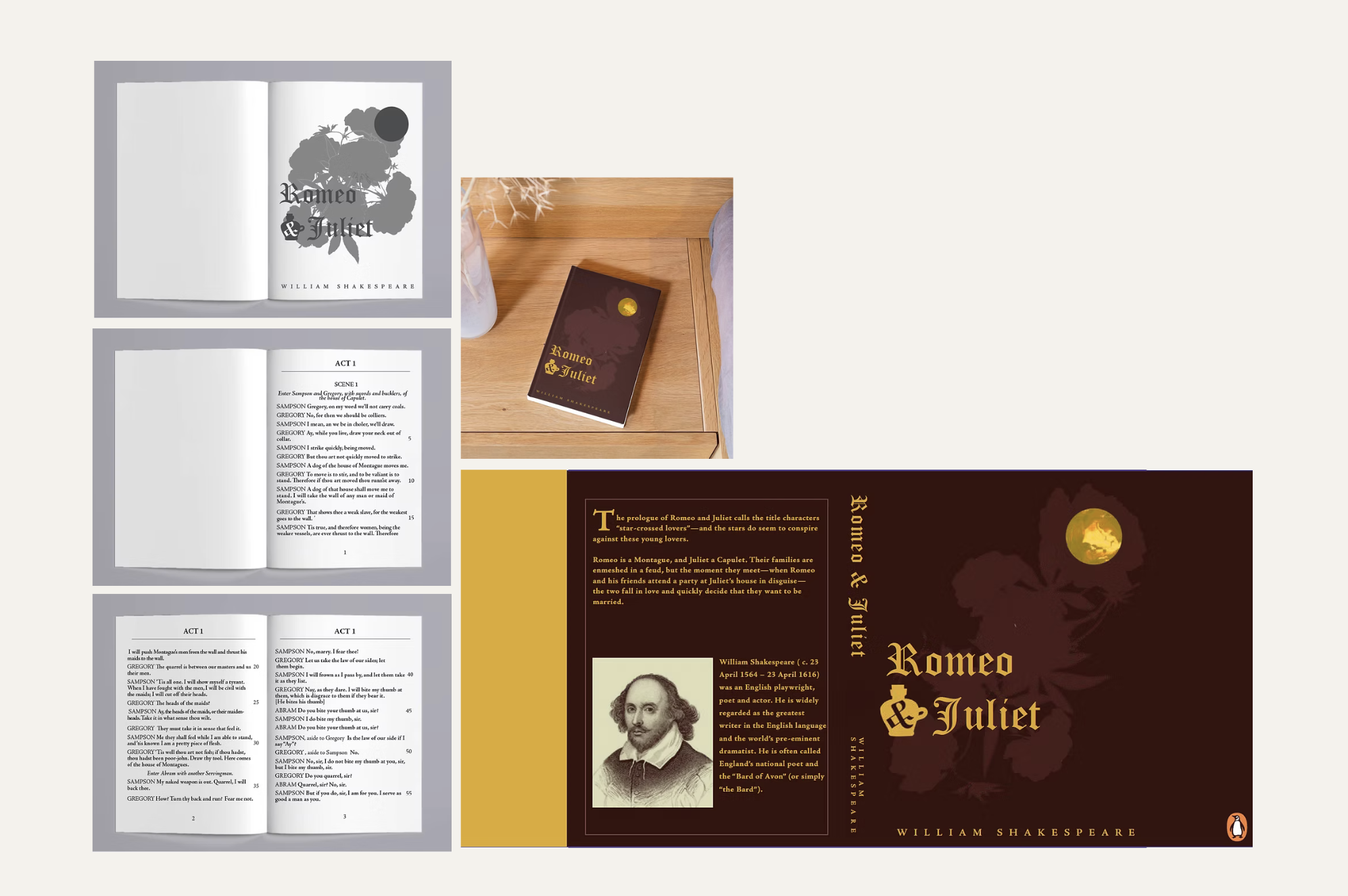
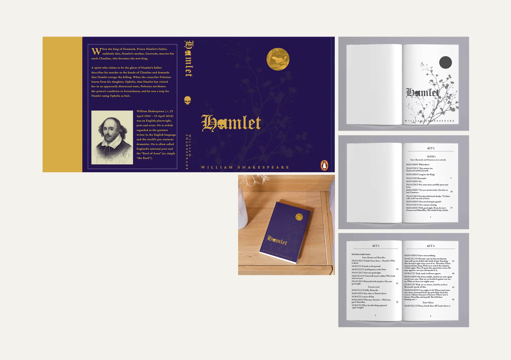
3 series · play cover design
elements to note ·
A tribute to the History: The golden moon in the corner of each cover contains a famous painting of each story.
Typographic Tragedy: In these tragedies, a very intentional motif of death resides in each story: I applied the main causes of death and division into the typographic elements of each title.
Symbolic flora: Shakespeare's reference to flora always revealed themes of his plays, so I created silhouettes of the key plant used in each story.
magazine · typesetting/formatting


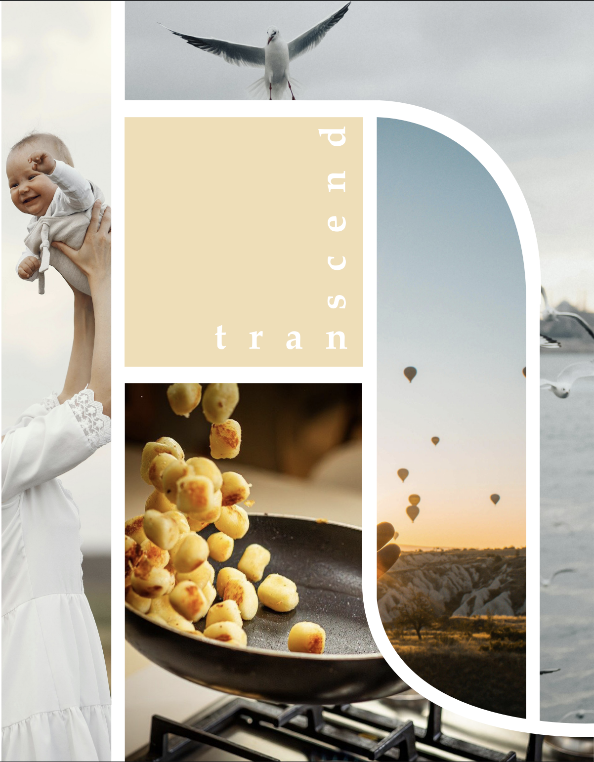
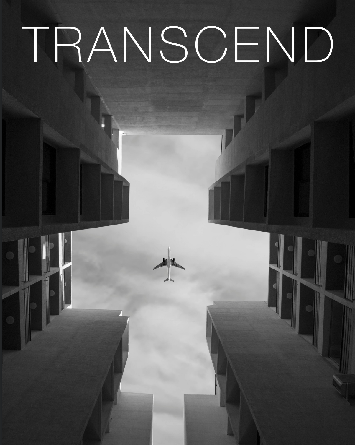
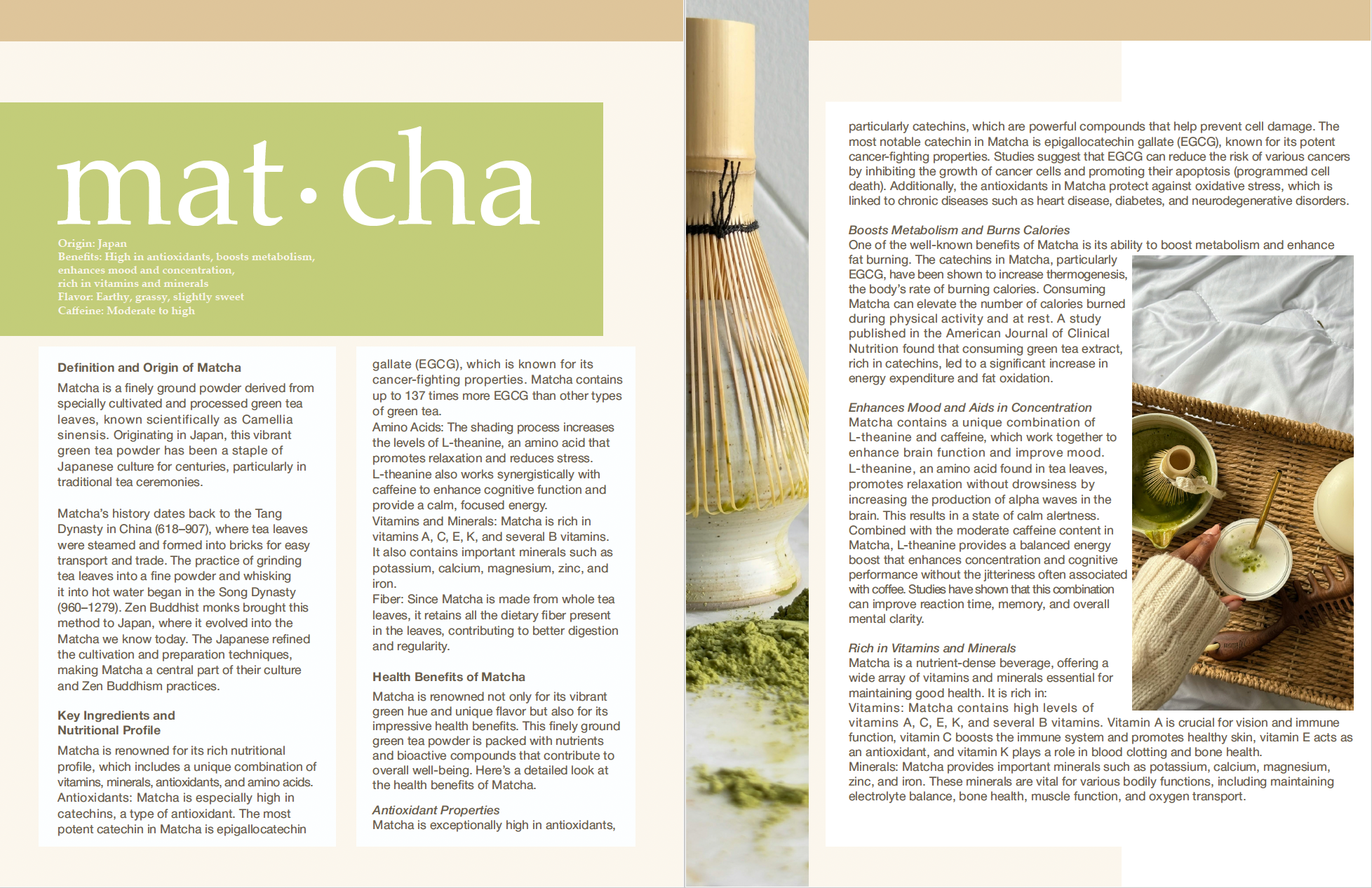
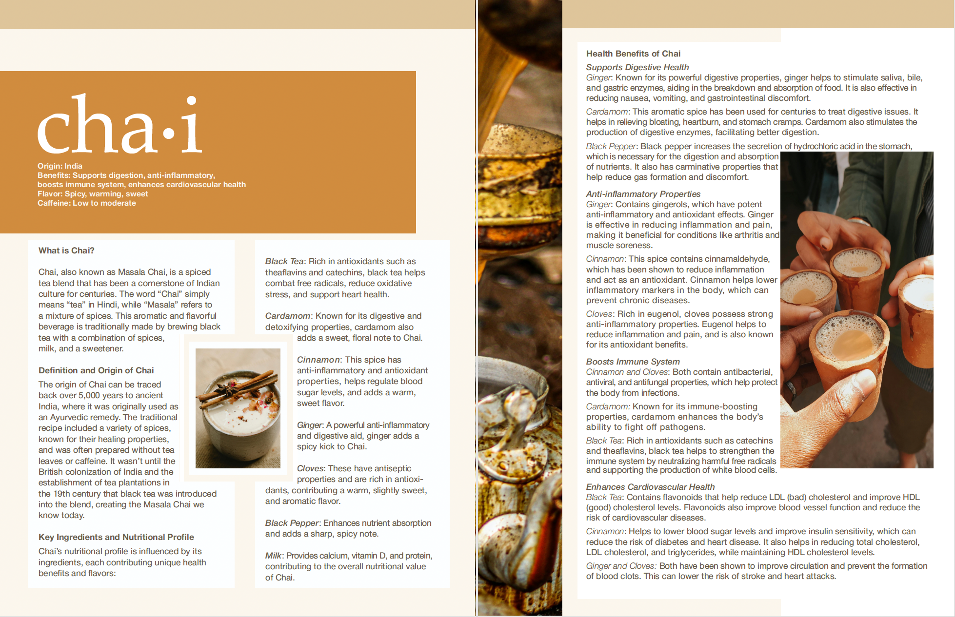
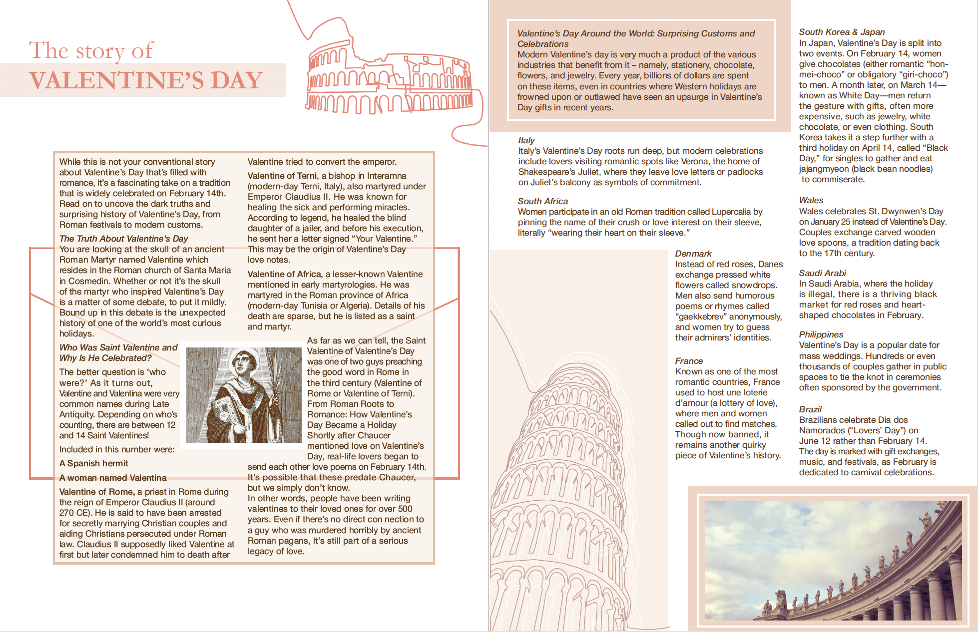
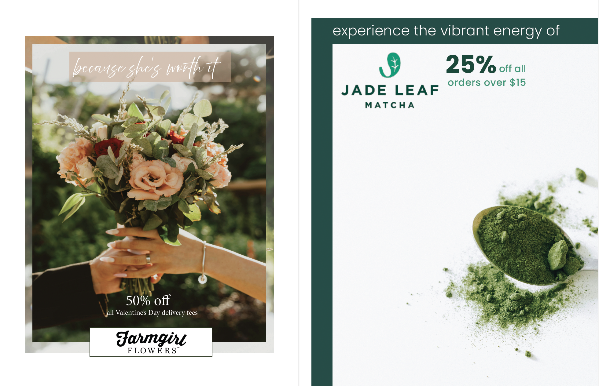
Participating in creating a cohesive class magazine, we worked as a staff of designers/editors to design covers and typeset articles to incorporate into the magazine within the parameters of 2 pages per article. Using a grid system, I created these beautiful layouts and typeset each article accordingly. On the left are a few cover designs I pitched to the team, and on the right are articles we integrated into the magazine!