· branding guide · logo design · branding assets · icon design · InDesign · illustrator ·
Branding


branding · guide
·
·
·
After much research on my favorite beverage spot, Coffee Haus, I wanted to curate a visual identity that truly reflects the soul, joy, and quality of this international treasure to current and future fans!
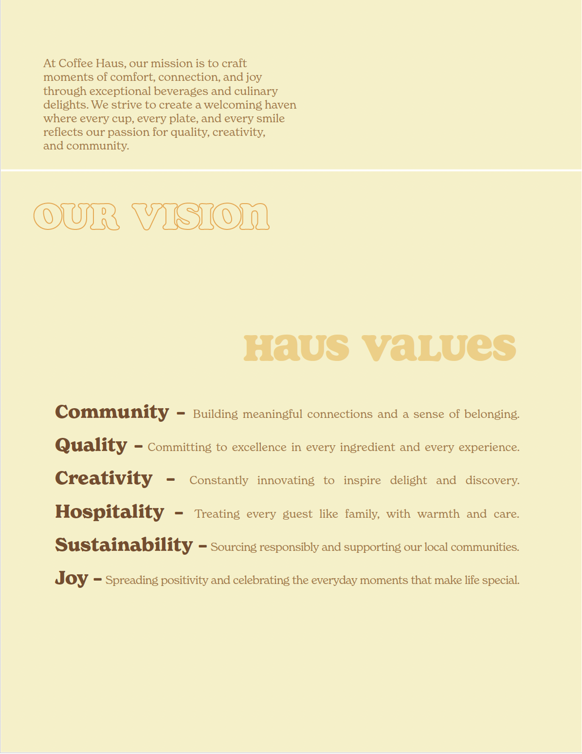
First, I solidified their core values into a comprehensive list and consolidated and clarified their mission statement.
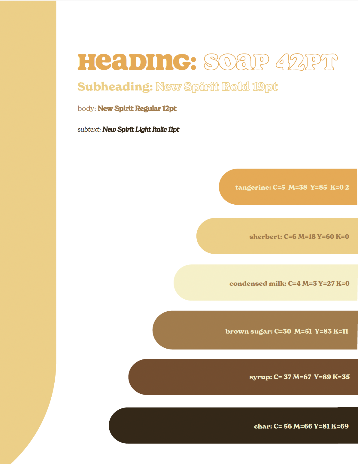
Then, to showcase its playful nature and signature orange , I designed a new logo, color palette, and typographic style to encapsulate their personality. To maintain a professional and clean look, I personalized a grid system that uses shapes derived from the new logo.
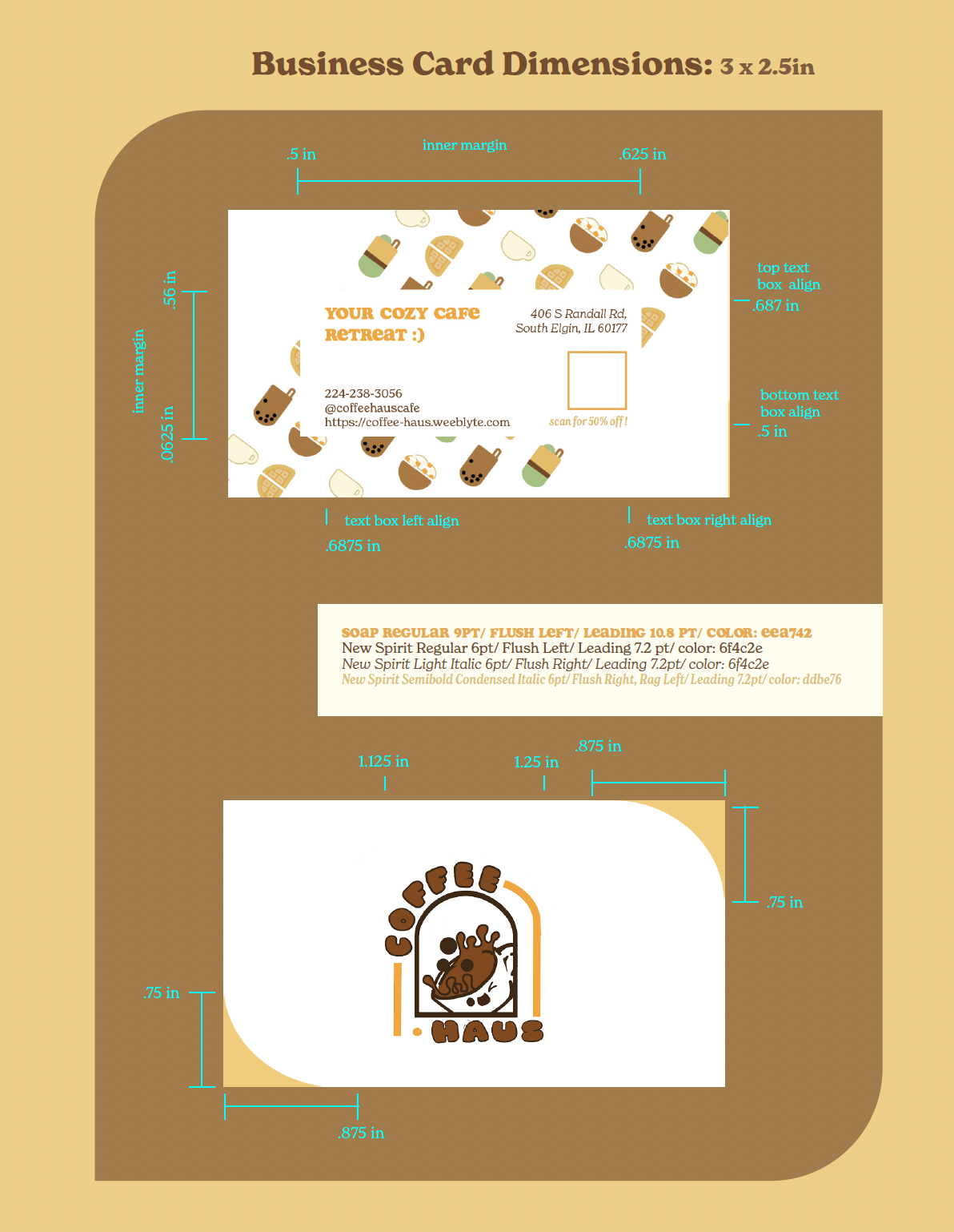
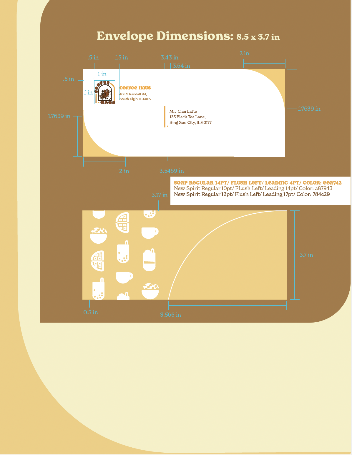
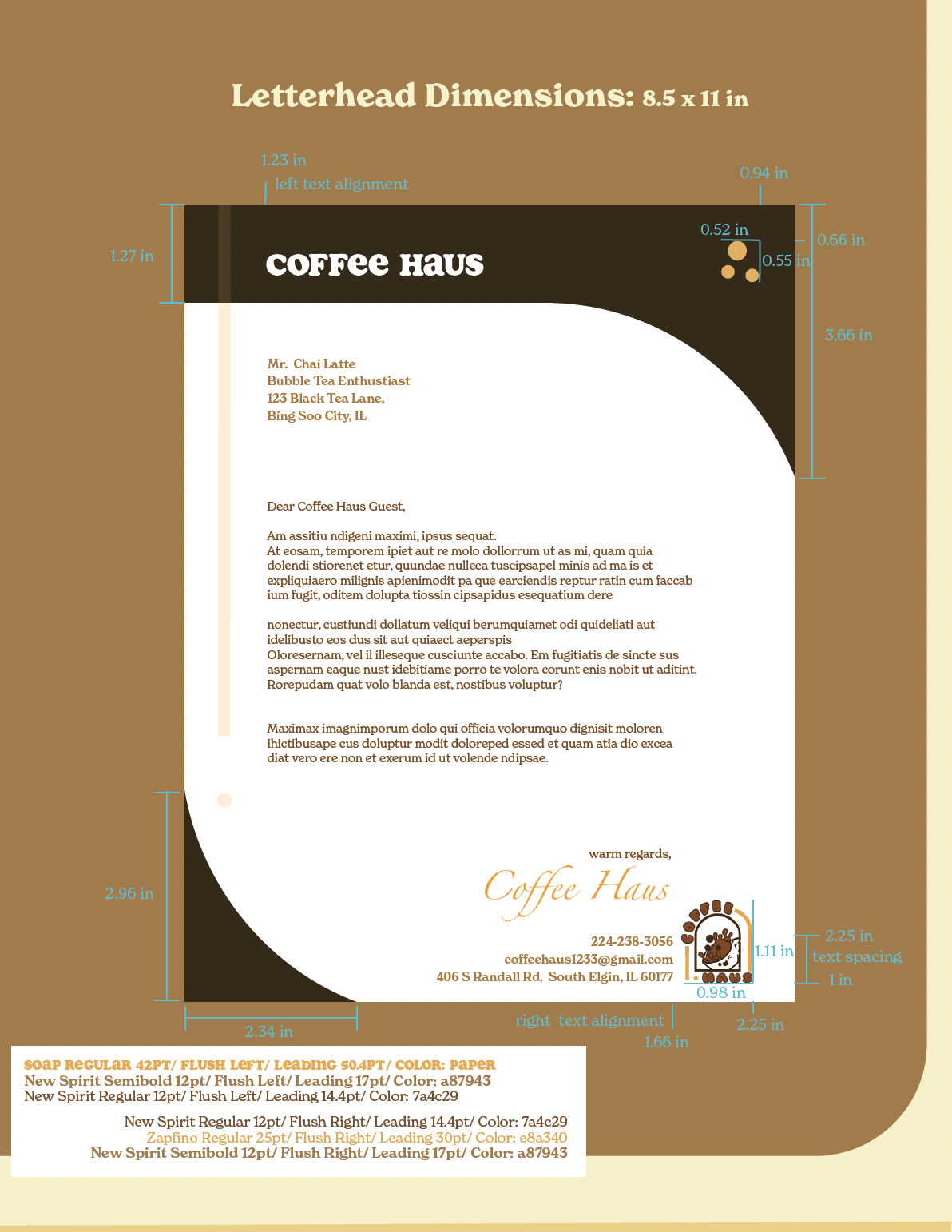
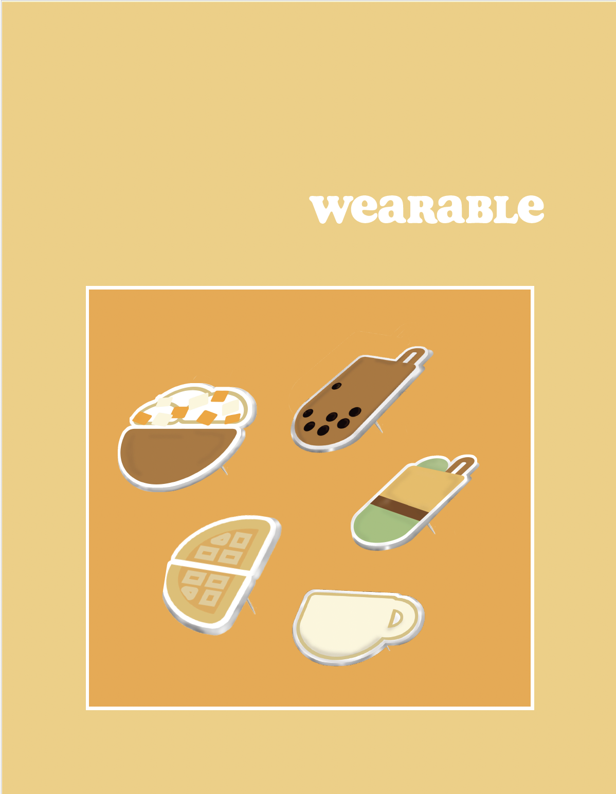
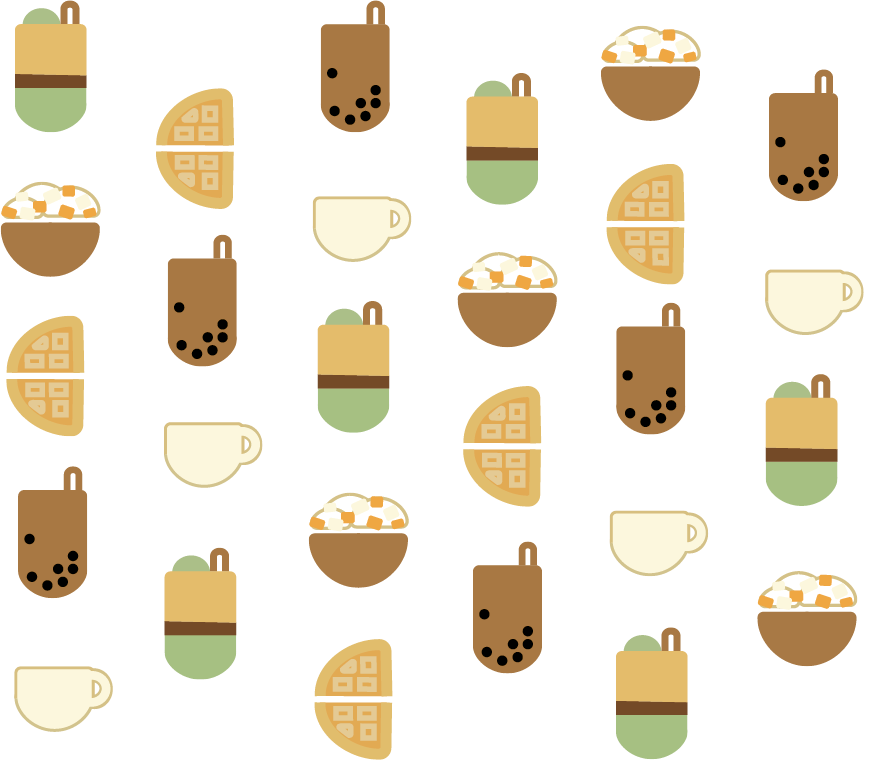
Finally, to feature the quality desserts and beverages they offer, I created an iconographic pattern of their desserts to use on their business card, stationary, and as adorable pins Coffee Haus fans can purchase and collect! These physical links also create a stronger sense of community and help people show their Coffee Haus spirit!


logo · design
related · icons


VIEWS BY
MALCOLM· the process ·
During this creative process, Malcolm explained his motivation, why he started his photography business, and what he was hoping to achieve. After solidifying his values and getting a sense of his personal style, I drafted a few different logos. He ended up selecting this elegant, minimalist logo and icon pair! Reintroducing, Views By Malcolm!
COFFEE HAUS
· the process ·
Coffee Haus a space for the community to gather and try a new international treat!
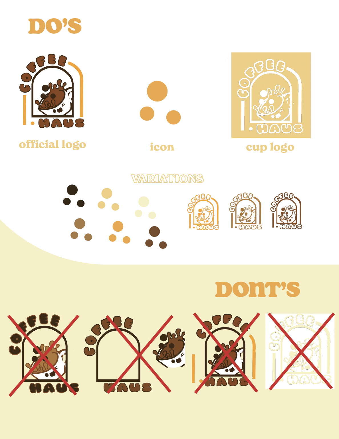
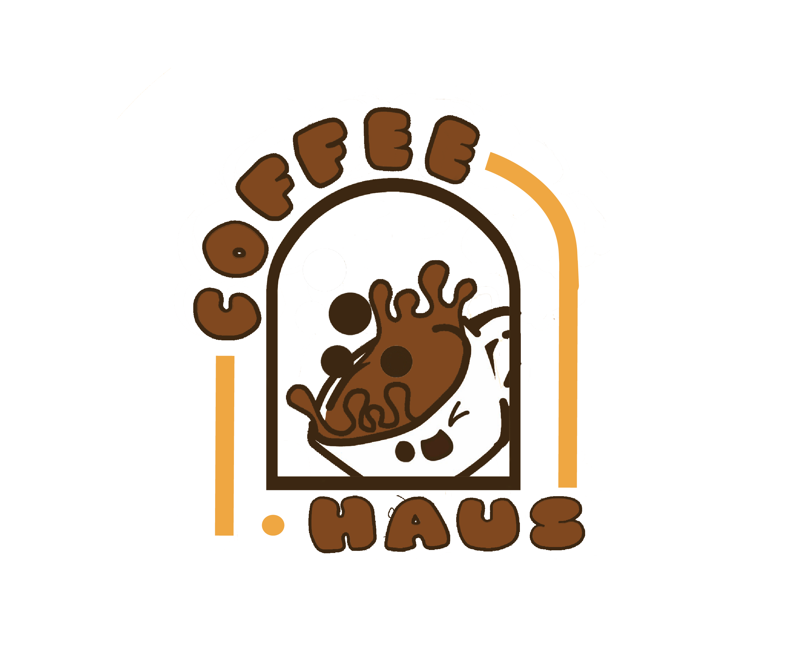
This is why I chose a door shape for the overall composition to mimic the feel of being welcomed home.Because of their Korean roots, their original logo had a cute but ambiguous character. To keep that cute and classic character alive, while matching it more closely with the treats they provide, I designed a happy little coffee cup with tapioca pearls playfully splashing out of the top!
In the end, we found the perfect mix of playfulness and minimalism to welcome everyone to Coffee Haus!
HV
DESIGNS· the process ·
Over the past few years, I've learned and evolved, just like my logo.
My personal style is clean, precise, and simple but intentional.
Using my initials, I created a pencil to represent my drawing ability and my traditional art origins.
Keeping it minimalist and very "computerized-clean" to represent the digital skills I've adopted and gain as I continue on my design journey!


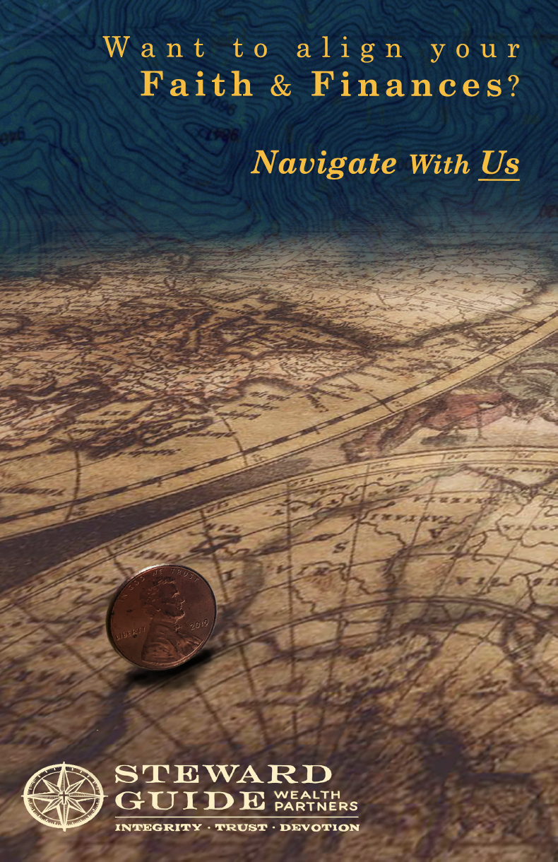
branding · assets
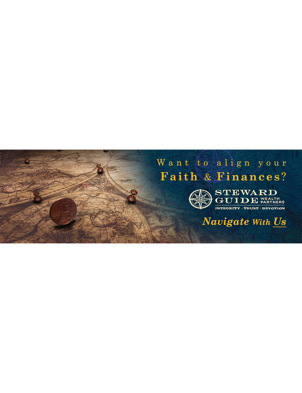
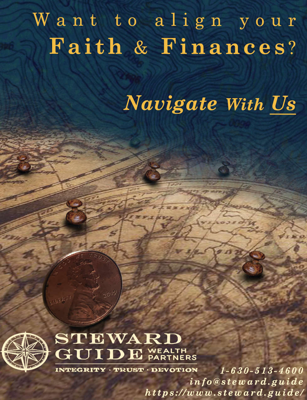
Drawing inspiration from the branding, motifs, and values of Steward Guide Wealth Partners, I created a collection of assets that reimagine their visual identity. The design approach focuses on clarity, strength, and cohesion, translating their mission into a modern and impactful visual language.